

A clinic brand guideline must document the logo system, color palette, typography, voice and messaging rules, photography standards, accessibility requirements, channel-specific applications, governance process, and a rollout checklist. These elements matter because inconsistent visuals and unclear language erode patient trust and can expose a practice to regulatory risk around treatment claims. The sections below walk through each piece with templates, accessibility notes, and a practical checklist you can act on this week.
TL;DR:
- Clear logo variations, precise size and clear space rules, and vector files are essential to avoid misuse and ensure consistent branding across all materials.
- Exact color values, usage proportions, and WCAG AA contrast standards are crucial for visual accessibility and maintaining a calm, professional appearance.
- One primary typeface pairing with fixed sizes and line length limits supports readability and accessibility for all patients.
- Messaging must be human-centered, empathetic, and vetted for clinical accuracy, with standardized phrases to ensure consistent patient communication.
- A well-structured governance system with approval workflows, asset library, and regular updates prevents inconsistency and maintains brand integrity across multiple channels.
Table of Contents
- Brand identity essentials: logo, variations, clear space, and sizing
- Color palette and proportions (accessibility-focused)
- Typography and typesetting for clinic communications
- Brand voice, messaging and patient-facing copy rules
- Imagery and photography: style, consent, and practical specs
- How to apply the identity across touchpoints: website, social, signage, print, and clinical materials
- Brand governance: approvals, asset library, version control and compliance
- Practical rollout checklist and ready-to-use templates
- How Growth Reach Marketing helps clinics implement brand guidelines
- Brand personality and values definition
- Usage guidelines for icons and graphic elements
- Co-branding and partnership branding rules
- Social media branding specifics and best practices
- Crisis communication guidelines related to brand usage
- Author perspective: practical pitfalls clinics commonly miss
- Build and enforce your clinic’s brand system with us
- FAQ
- Sources
Brand identity essentials: logo, variations, clear space, and sizing
Your logo system needs a documented master version plus approved variations: a horizontal lockup, a stacked version, a mark-only icon, and single-color versions for dark or busy backgrounds. Staff and external vendors need to know exactly when to use each one, not guess based on what looks right.
Clear space protects the logo from crowding. A common rule is to reserve space equal to the height of the main symbol or initial letter on every side, so the mark never touches text, photos, or page edges. Minimum size rules matter just as much: set a minimum width for digital use (commonly around 120 pixels) and a minimum width for print (often 1 inch), below which the mark becomes illegible or the fine detail disappears when printed.

Large health systems like Cleveland Clinic structure their identity systems with exactly this level of specificity, covering logo use, color, typography, and photography in a single reference document that staff and agencies can consult without guesswork. A smaller clinic can adapt that same structure at a fraction of the scale.
Document the dos and don’ts clearly:
- Never stretch, skew, rotate, or recolor the logo outside the approved palette.
- Never place the logo on a busy photo background without a solid color plate behind it.
- Never recreate the logo in a different font or redraw the icon by hand.
- Always export logos as vector files (SVG or EPS) for print vendors and PNG with transparency for digital use.
Provide a downloadable asset pack with all approved file types so no one has to ask the original designer for a new export every time a sign or brochure needs printing.
Color palette and proportions (accessibility-focused)
Every clinic brand guide needs exact color values, not vague descriptions like “calming blue.” Document primary, secondary, and accent colors with hex codes for digital, RGB for screens, and CMYK for print, so a sign shop and a web developer produce the same shade.
Usage proportions prevent visual chaos. A workable rule: primary color dominates 60 to 70% of any layout, secondary colors fill supporting space, and accent colors stay limited since accent colors should not exceed about 30% of page area to keep materials legible and calm rather than busy.
- Define primary, secondary, and accent swatches with hex, RGB, and CMYK values.
- Cap accent color use at under 30% of any single layout.
- Test every text-on-background pairing with a contrast checker before publishing.
- Keep a documented backup palette for grayscale or low-ink print jobs.
Healthcare visual identity needs to meet WCAG AA contrast standards, which means body text requires a contrast ratio of at least 4.5:1 against its background. A free contrast checker takes seconds to run and should be a standard step before any new material goes to print or goes live on the website.
Typography and typesetting for clinic communications
Pick one primary typeface for headings and one for body copy, then name a web-safe fallback for each in case the primary font fails to load. A common pairing is a distinctive sans-serif for headings (something like Montserrat or Proxima Nova) paired with a highly readable serif or sans-serif for body text (Georgia, Lato, or Open Sans), with Arial or Helvetica as the universal fallback for office documents and email signatures.
Hierarchy needs explicit rules, not instinct. Set defined sizes for H1, H2, H3, and body text, and specify line length guidance since lines longer than roughly 75 characters become harder to read, especially for older patients or anyone reading on a phone.
- Name one primary heading font and one primary body font, each with a fallback.
- Set fixed point sizes for headings, subheadings, and body text across web and print.
- Limit line length to roughly 60 to 75 characters for body paragraphs.
- Avoid decorative or script fonts anywhere patients need to read clinical information.
Decorative typefaces might look elegant on a spa-style landing page, but they slow reading speed and fail accessibility checks for anyone with low vision. Save them, if at all, for a logo wordmark only, never for body text or form instructions.
Brand voice, messaging and patient-facing copy rules
Your voice guide needs three or four plain principles: human-centered, confident, empathetic, and plain-spoken rather than clinical jargon. Healthcare branding tends to favor active, reassuring language over technical or overly casual tones, with terms built around support, reassurance, and clarity rather than sales pressure.
Microcopy deserves its own rules because small text carries real weight. Appointment reminders, intake forms, and confirmation emails should use warm, direct phrasing: “Your appointment is confirmed for Tuesday at 2 PM” reads better than a cold, system-generated line. Any phrase describing a treatment outcome needs careful review, since claims about results, safety, or efficacy can cross into regulated territory depending on your market and the treatment in question.
- Write in plain, active language and avoid unnecessary clinical jargon in patient-facing copy.
- Review any outcome or efficacy claim with clinical staff before publishing.
- Keep a short glossary of approved terms and banned phrases for marketing and front-desk staff.
- Match tone across email, SMS, and printed materials so patients recognize the same voice everywhere.
Pro Tip: Build a one-page “approved phrases” sheet that front-desk staff and marketing can both reference, so patient-facing language stays consistent whether it’s on a form, a text reminder, or an Instagram caption.
For deeper guidance on tone and sample language, our practical guide to aesthetic brand voice walks through how to translate these principles into real copy.
Imagery and photography: style, consent, and practical specs
Photography should feel authentic rather than stocky: natural light, real staff and patients where possible, genuine expressions instead of posed stock photography. Illustrations work well for abstract concepts (how a treatment process works, step-by-step diagrams) where a real photo would feel staged or where patient privacy makes a photo impractical.
Consent is non-negotiable. Hospital and clinic brand guides commonly build in formal photography sections that include model release policies and approval requirements to protect patient privacy, since any identifiable patient or staff photo used in marketing needs documented, signed consent before it goes anywhere public.
- Use natural light, candid framing, and real people over obvious stock photography.
- Collect a signed model release before using any identifiable patient or staff photo.
- Keep a dated log of consent forms tied to each image file name.
- Export web images at a minimum of 1,500 pixels wide and crop headshots to a consistent 1:1 ratio.
Set aspect ratio standards once and reuse them everywhere: square crops for avatars and team headshots, 16:9 for website banners, and 4:5 for social posts, so a photo never looks stretched or oddly cropped when it moves between channels.
How to apply the identity across touchpoints: website, social, signage, print, and clinical materials
A brand system only works if it behaves the same way everywhere a patient encounters it. Document specifics for each channel so nobody improvises:
- Website: place the logo in the top-left header at a consistent size, maintain WCAG AA contrast on every button and link, write descriptive alt text for every image, and list web-safe font fallbacks in your CSS so the site degrades gracefully if a custom font fails.
- Social media: standardize avatar crops at 1:1, publish a small library of post templates (announcement, testimonial-style, educational tip) in the brand colors, define Instagram and Facebook story dimensions, and write one approved bio line reused across every platform.
- Signage and physical materials: specify logo placement and minimum size for exterior signs, reception displays, and appointment cards, and name approved materials (vinyl, acrylic, printed cardstock) so a sign vendor in any location produces a matching result.
- Staff badges and uniforms: set a fixed logo size and placement for badges and embroidered uniforms so every location looks part of the same practice, not a franchise with mismatched branding.
Practical execution examples, including how clinics translate these rules into real marketing creative, show up well in our beauty clinic content marketing examples, which illustrate how a documented system turns into finished campaigns rather than one-off designs.
Brand governance: approvals, asset library, version control and compliance
Someone needs final sign-off authority, typically a practice manager or marketing lead working alongside a clinical reviewer for anything touching treatment claims. A simple two-step approval flow works for most clinics: draft review by marketing, then a clinical check for any copy describing results or safety before anything publishes.
- Name one or two approvers and require their sign-off before any new asset goes live.
- Store every approved file in a single shared folder or digital asset manager, never scattered across personal drives.
- Use clear file naming and version numbers so outdated logos or old color swatches never resurface by accident.
- Keep a short changelog noting when the guide itself was last updated and by whom.
Well-structured brand guides, like the governance model in Trillium Health Resources’ guidelines, pair asset rules with defined approval processes and publication cycles. In Ireland, any marketing copy referencing a medicine, device, or treatment outcome should also be checked against HPRA advertising guidance before publication.
Practical rollout checklist and ready-to-use templates
Rolling out a new brand system works best in stages rather than all at once.
- Audit every existing asset, from the website to printed forms, and flag anything using an outdated logo or off-brand color.
- Fix quick wins first: email signatures, social avatars, and the homepage header logo.
- Publish the full template pack and store it where every staff member can find it.
- Train front-desk and marketing staff on the approved voice and visual rules in a short session.
- Monitor new materials monthly and correct drift before it spreads across locations.
| Template | File type | Where to host it |
|---|---|---|
| Logo pack (all variations) | SVG, EPS, PNG | Shared drive or DAM |
| Color and font reference sheet | Shared drive, printed for front desk | |
| Social post templates | Canva or PSD | Marketing team folder |
| Email signature | HTML snippet | IT or email platform |
Before any asset ships, run a quick QA pass: check contrast ratios, confirm alt text is written, verify clear space around the logo, and confirm the copy matches your approved phrase list.
How Growth Reach Marketing helps clinics implement brand guidelines
We work directly with aesthetic clinics and beauty brands to turn a brand guideline document into finished, consistent materials across web, social, and print. Our services cover branding support, accessibility fixes on existing sites, and ready-to-use social templates built around your palette and voice.
Hiring outside help makes sense when internal bandwidth is thin or when a rebrand needs to launch across multiple locations at once. A first engagement typically starts with an audit of current assets, followed by a roadmap and a prioritized set of deliverables, similar to the approach outlined in our med spa brand positioning case notes.
Brand personality and values definition
Before the visual rules, define who your clinic is as a brand. Personality and values are not slogans. They are the handful of traits that should show up consistently in every patient interaction, from the reception desk to the website copy.
Pick three or four personality traits that genuinely describe how your team treats patients: approachable, precise, calm, straightforward. Avoid generic choices like “professional” or “caring” that every competitor also claims, since they give staff nothing specific to act on.
Values go one layer deeper than personality. A clinic that values transparency might commit to publishing clear pricing and realistic expectations rather than vague promises. A clinic that values accessibility might commit to plain-language forms and step-free entry. Write these down as specific commitments, not abstract ideals, because a value only matters if it changes a real decision, like how a treatment outcome gets described or how a complaint gets handled.
Once personality and values are defined, they should shape the voice guide, the imagery choices, and even which touchpoints get priority. A calm, precise personality suggests simpler layouts and fewer competing colors on a page. A warm, approachable personality suggests more candid photography and less formal copy. Treat this definition as the foundation the rest of the guide builds on, not a separate exercise that sits unused after the branding workshop ends.
Usage guidelines for icons and graphic elements
Icons and supporting graphics need the same discipline as the logo itself. Pick one icon style, either outlined or filled, and stick with it everywhere: a mix of styles on the same page looks unfinished even when the colors match.
Set a consistent stroke weight and corner radius across the icon set so a calendar icon and a phone icon look like they belong to the same family. Limit icon colors to one or two from the approved palette rather than letting every icon carry a different accent shade.
- Choose one icon style (outlined or filled) and apply it across every touchpoint.
- Restrict icon colors to one or two approved palette shades.
- Keep decorative graphic elements (dividers, background patterns) subtle enough not to compete with text or compromise contrast.
- Store the icon set as a single library file so new team members pull from one source instead of downloading random icons online.
Supporting graphics like background patterns or section dividers should reinforce the brand without distracting from the content. A patterned background behind body text is a common accessibility failure point, since it can drop contrast below WCAG AA thresholds even when the text color itself passes on a plain background. Test icon and graphic combinations the same way you test color pairings, because a pretty icon that fails a contrast check still needs to be fixed before it ships.
Co-branding and partnership branding rules
Clinics frequently need to appear alongside another brand: a product manufacturer’s logo on a treatment page, a referral partner’s logo on a joint flyer, or a supplier’s badge on the website. Document a clear hierarchy for these situations before the first request comes in.
A simple rule works well: your logo stays visually equal or primary, never smaller or less prominent than a partner’s mark, unless the partnership agreement specifically states otherwise. Use a neutral divider, such as a vertical line or consistent spacing, between two logos rather than letting them touch or overlap.
Specify which variations are approved for co-branded materials. A single-color or icon-only version of your logo often works better in tight co-branded layouts than the full horizontal lockup, since it avoids visual competition with the partner’s own colors. Set a rule that any co-branded material still needs the same approval step as any other asset, since a partner’s design team will not know your contrast requirements or voice guidelines unless someone tells them.
Keep a short record of every co-branding agreement and its approved layout, so the next partnership does not start from scratch. This also protects against a partner reusing an outdated version of your logo on their own materials months after a brand update.
Social media branding specifics and best practices
Social platforms compress your brand into a small avatar and a handful of pixels, so the rules here need to be more specific than for other channels. Set a fixed avatar crop (square, centered on the icon or initials) and apply it identically across every platform, since profile photos render at different sizes but should always read clearly even at the smallest display size.
Build a small set of reusable post templates rather than designing every post from scratch: an educational tip format, a before-and-after format where consent allows, and an announcement format. Each template should use the approved palette and typography so a scroll through your feed feels cohesive rather than like five different accounts.
- Standardize avatar crops and cover image dimensions across every platform.
- Write one approved bio or “about” line and reuse it everywhere rather than rewriting it per platform.
- Apply the same voice and approved phrase list to captions as you do to the website and intake forms.
- Review any post referencing treatment results against your clinical approval step before it publishes.
Story and reel formats need their own spec sheet too, since vertical content gets cropped unpredictably across platforms if the logo or key text sits too close to the edge. Keep a safe zone in every vertical template so nothing important gets cut off on different devices.
Crisis communication guidelines related to brand usage
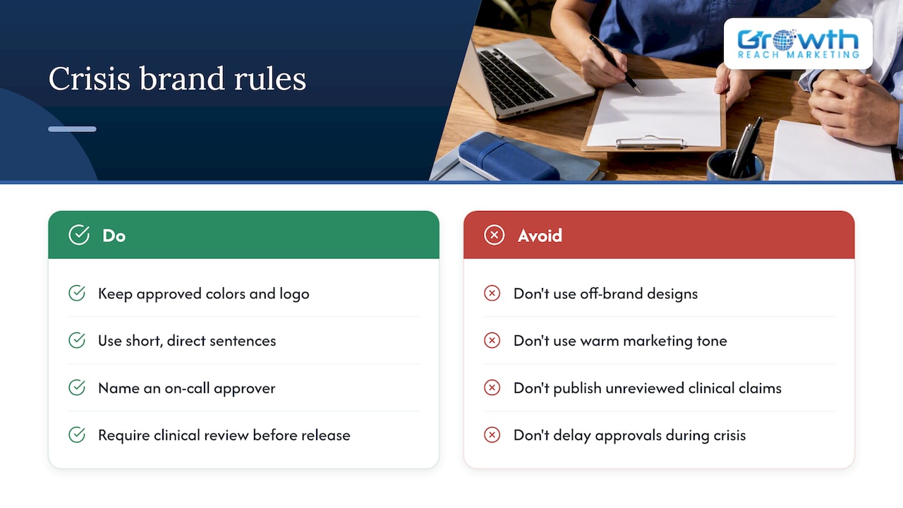
A brand guide should include a short plan for what happens to your visual identity and voice during a crisis, whether that is a negative review going viral, a service complaint, or a public health concern affecting patient confidence. The goal is not to suppress the brand during a crisis but to keep it recognizable and calm rather than panicked or inconsistent.
Set a rule that crisis communications still follow the approved color palette and logo use, since an off-brand, hastily designed statement can look less credible than one that matches your normal materials. The tone, however, should shift: shorter sentences, direct acknowledgment of the issue, and a clear next step for the reader, rather than the warmer, more conversational tone used in routine marketing.
Name who has authority to approve a public statement during a crisis, and make sure that person is reachable outside normal business hours, since crises rarely wait for the next scheduled approval meeting. A single sentence in your governance section, naming this person and the fallback approver, prevents a delay that makes the situation worse.
Any statement touching clinical outcomes, safety, or treatment claims during a crisis needs the same clinical review as routine marketing copy, arguably with more urgency rather than less. A rushed, unreviewed statement during a sensitive moment carries more reputational and regulatory risk than a slightly delayed but accurate one.
Author perspective: practical pitfalls clinics commonly miss
The three mistakes I see most often: accessibility gets treated as a nice-to-have and skipped under deadline pressure, logo files get recreated by hand instead of pulled from the master pack, and nobody owns final approval so three versions of the same flyer circulate at once. Each fix is simple: run a contrast check before publishing, maintain one logo asset library, and name one approver in writing.
The harder balance is tone. Clinical accuracy and warm, clear marketing language can pull against each other, but a guide that forces every claim through a quick clinical check protects both.
— Gerard
Build and enforce your clinic’s brand system with us
Writing the guideline document is the easier half. Keeping every location, every staff member, and every new hire actually following it is where most clinics lose consistency within a year. We help beauty and aesthetic clinics turn a brand guide into enforced reality through consistent social media management, accessible website fixes, and on-brand ad creative across every campaign.
A first project usually starts with a short audit of your current materials, followed by a prioritized list of fixes and a template pack built around your palette and voice. If you are ready to put a system in place rather than keep patching individual assets, visit our services page to learn about digital marketing services that help keep your brand consistent while it grows.
FAQ
What should a clinic brand guideline include at minimum?
At minimum, a clinic brand guideline should cover the logo system with clear space and sizing rules, a documented color palette with exact values, typography and hierarchy rules, voice and messaging guidance, photography standards, accessibility requirements, and a governance process for approvals. Without these core pieces, consistency breaks down the moment more than one person creates marketing materials.
Why does accessibility matter in clinic branding?
Accessibility ensures patients with visual impairments or reading difficulties can actually use your website, forms, and printed materials. Healthcare visual identity needs to meet WCAG AA contrast standards, which sets a measurable bar for text and background color combinations rather than leaving legibility to guesswork.
How often should a clinic update its brand guidelines?
There is no fixed universal schedule, but most organizations review their brand guide whenever a significant visual or service change occurs, or at minimum once a year to catch outdated examples and broken links. A living document with version notes, similar to the structure used in large health system guides, makes it easy to track what changed and when.
Do clinics need legal review for brand messaging?
Any marketing copy that references treatment outcomes, safety, or efficacy should be reviewed by clinical staff and checked against relevant advertising regulations before publication. In Ireland, this means aligning promotional claims with HPRA guidance on advertising human medicines.
What does Growth Reach Marketing charge for brand implementation?
Pricing for our Facebook and Instagram Ads Management, Social Media Management, and LinkedIn Management services is available on request through our services page, since every clinic’s scope and starting point differ.
Sources
- Accessible Web — Color contrast checker
- HPRA — Advertising human medicines in Ireland
- Design Guidelines | Cleveland Clinic OnBrand
- Trillium Health Resources — Brand guidelines (October 2024)